Bentley Has A New Logo, And We’ll See It On A Concept Next Week

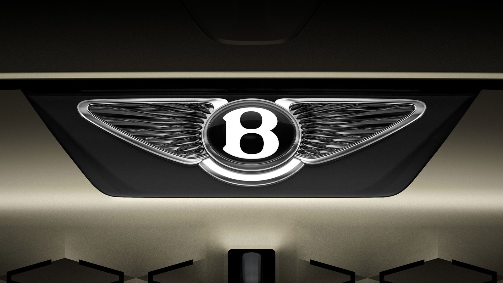
Car companies refreshing their logos has been all the rage of late, as lots of manufacturers take on a crisper, more minimalist corporate aesthetic (or, in Kia’s case, make everyone think the company’s called KVI). ‘Minimalist’ and ‘Bentley’ don’t necessarily go together, though, so while the Crewe company has just given its own badge an update, it’s still as ornate as you’d hope.
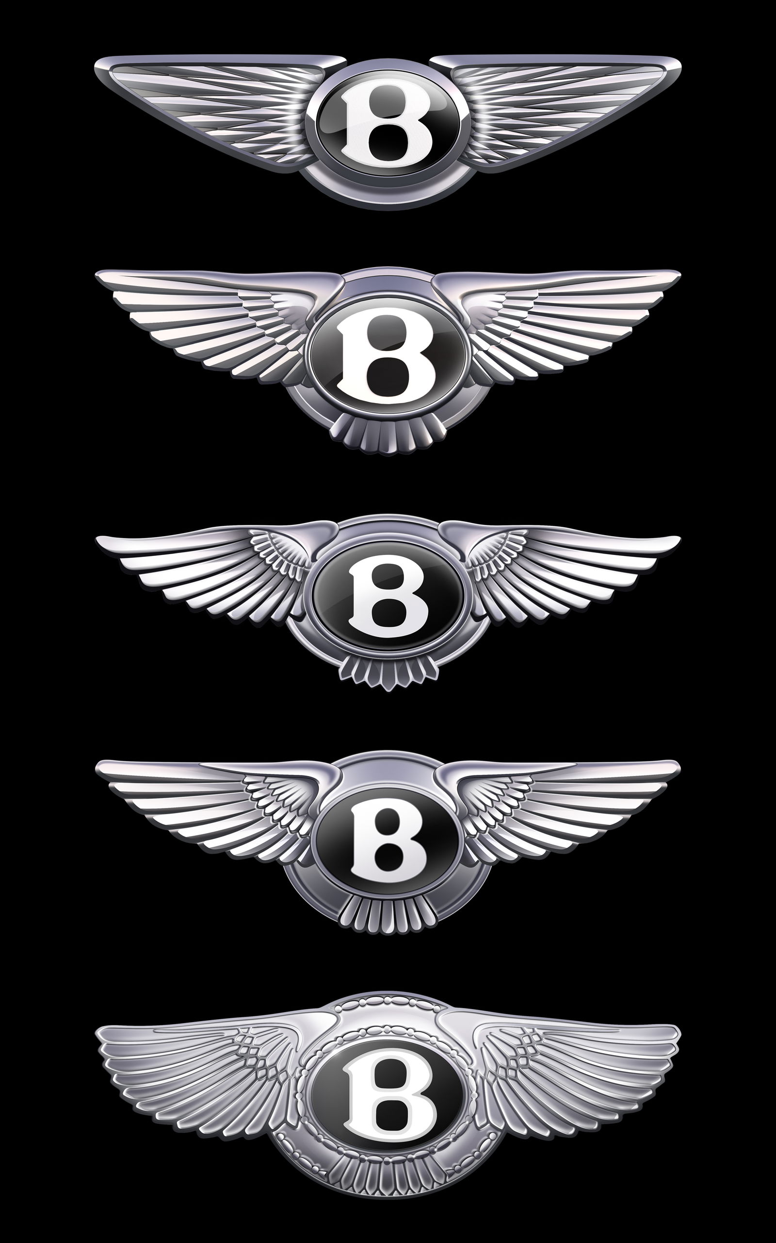
It’s still recognisably Bentley, incorporating a ‘B’ in the brand’s trad typeface with wings sprouting from either side, but the feather pattern on those wings is more abstract and ornate than before. The wings themselves are more angular, too, said to resemble those of the 200mph-capable peregrine falcon.

Designed under the auspices of Bentley’s design boss Robin Page, the new logo was developed from an initial sketch by Young Nam, part of the brand’s interior design team. His original design won an internal competition, after which a small team refined it into what you see here. It’s only the fifth version of the logo in the 106 years that the company’s existed.
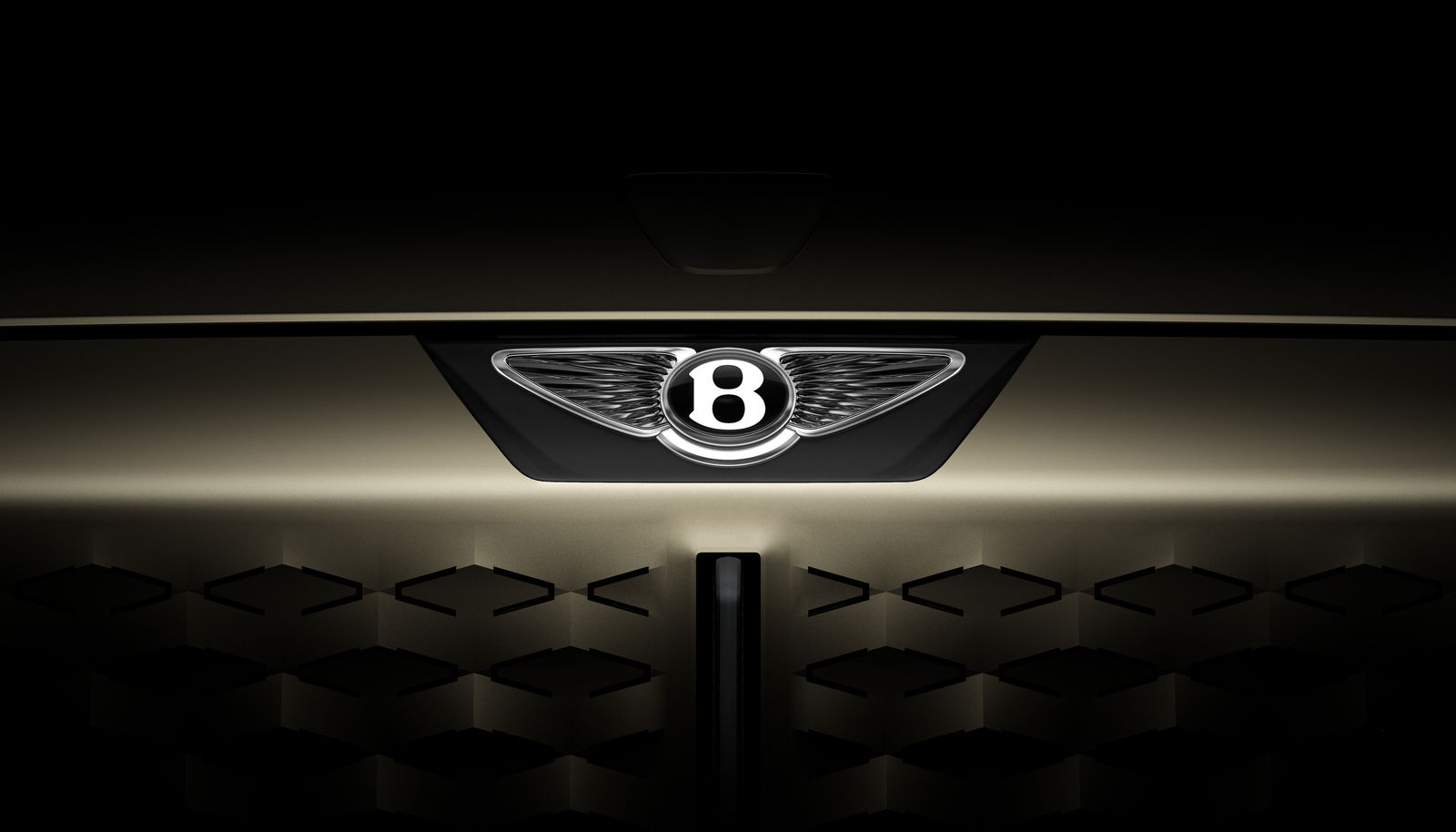
But wait! What’s that swishy gold thing it’s sat on in the picture above, complete with those A-shaped cutouts? Well, that’s a new concept car that we’ll see a week from today, on 8 July, designed to hint at Bentley’s future styling direction. We don’t know a whole lot about it yet, but we can cobble together some information.

Bentley says the concept won’t preview a forthcoming production car, so it probably won’t be an early look at the new sub-Bentayga electric SUV the brand is readying. It will, however, be “inspired by an iconic Bentley of the past,” so guesses on a postcard. Le Mans Blower? R-Type Continental? We’ll find out soon enough.
Until then, what do you reckon to the new look? Whatever your opinion, you can’t deny that Bentley’s put more effort into its new badge than VW Group stablemate Lamborghini.


Comments