Hiding Basic Car Controls In A Touchscreen Is Stupid And Distracting

Last week, the first reviews of the new Volvo XC90 began to emerge. It’s a crucial car for Volvo, but I couldn’t help but focus on one particular detail: much of the basic interior controls - such as the climate control - are accessed through a large touchscreen on the dash.
Immediately, my heart sank. It’s one of my pet hates when it comes to infotainment systems, and the fact that Volvo is going down this route is downright depressing. Why? Because after all the effort Volvo has gone through to make its new SUV as safe as possible, the company has chosen to make basic controls massively distracting to use. And it’s not alone.

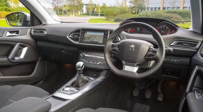
Peugeot makes a big deal about the decluttered dash in its 308, but it’s an utter pain having to fiddle about with sub-menus just to change basic settings. And that one screen has to do too many things: want to change something on the stereo? Fine, but I hope you don’t mind your navigation disappearing while you do so…
The worst offender, though, is the Tesla Model S. The 17-inch touchscreen is a fantastic bit of kit, and great for internet browsing when you’re not moving or have a passenger to keep occupied, but almost every single control has been hidden amongst various sub-menus. Even the sunroof.
When taking one to Paris recently (full feature coming soon) it was frequently infuriating, and damn-near impossible for the driver to operate without taking our eyes off the road for worrying periods of time. And that’s not something that’ll change after spending time with the car; you’re unlikely to be able to learn to operate it without looking, as you might do with manual controls (although it is worth noting that many functions can be accessed using the steering wheel-mounted thumbnails). If you ever see a Model S straying over to your side of the road with the driver gormlessly looking down at their dashboard, you’ll know why.

The reason given for this daft approach to car design is decluttering. And to an extent, I get that. Decluttering is good. It makes things look clean and crisp. But at the expense of safety? And usability? That’s madness.
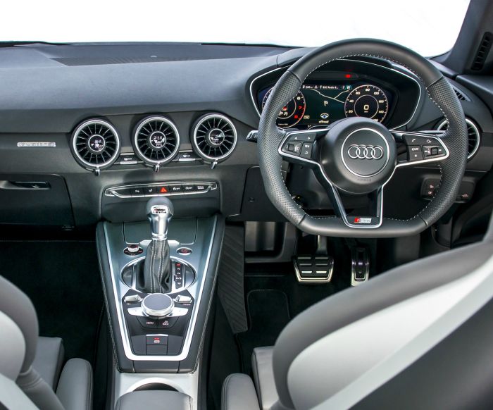
If you’re adamant the car you’re designing needs a minimalist interior, there are other ways of going about it. Just look at the new Audi TT: the infotainment screen is a 12.3-inch LCD that also forms the instrument binnacle, so you get your nav and speed readout on one screen. On the centre console, meanwhile, you get proper heater controls with integrated temperature readouts, each mounted on the vents themselves so they don’t take up space elsewhere.
With any luck, other manufacturers will follow suit and will find other ways to declutter, rather than these loathsome touch screens. But I have a nasty feeling that won’t happen.


Comments