Lotus Has A New Logo For The First Time Since 1989

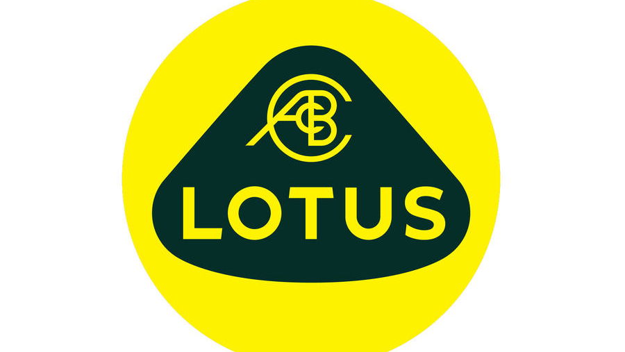
Lotus has revealed the badge that will adorn its new cars from now on, including the 1973bhp Evija electric hypercar.
The eighth iteration of the famous yellow and green roundel has been brought in to accent the brand’s shift from its established business model to a new age of battery-driven performance machines.

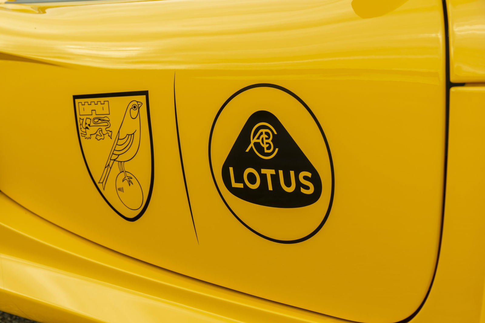
It has been simplified from the 3D-effect, silver-accented item used with only minor tweaks since 1989, and now exists as a flat yellow circle beneath a British Racing Green design. The now straightened Lotus text has switched from a serif font to a sans serif, in keeping with the original 1948 design.
The ACBC logo, denoting founder Anthony Colin Bruce Chapman’s initials, is still there. It has been on every Lotus badge except for the short-lived 1986 revamp; replaced a year later. Since being bought by Geely, which also owns Volvo, it’s thought that Lotus’s entire outlook has shifted from the past to the future. The new logo is said to reflect that.


Comments
I like this logo, looks more modern in my opinion
“We need to revamp the logo!”
“Well I can’t do it, I’m far too busy! Let the work experience kid do it.”
Even if the text was a silver/grey colour, it wouldn’t be so bad.
i will really miss the old one
I see now difference, you purists are just overreacting
it’s good that they haven’t changed it that much and instead just modernised it slightly
Its minimalist modern, i like it
It looks like something I could’ve thrown together in Forza
It looks like it’s from the 80’s, not that that’s a bad thing
I might be the only one that thinks it looks the same
Pagination