7 Car Manufacturer Logo Updates You Might Have Missed

Redesigning logos seems to be the in-thing for manufacturers right now. Partly driven by the rise of electrification, which is being used as an excuse for companies to reinvent brand images, we’ve seen a deluge of changes over the last 12 months.
Mostly, these seem to revolve around making cleaner, simpler versions of existing logos, although there are some more involved exceptions. What do you think of these rebrands? Let us know in the comments.
Peugeot
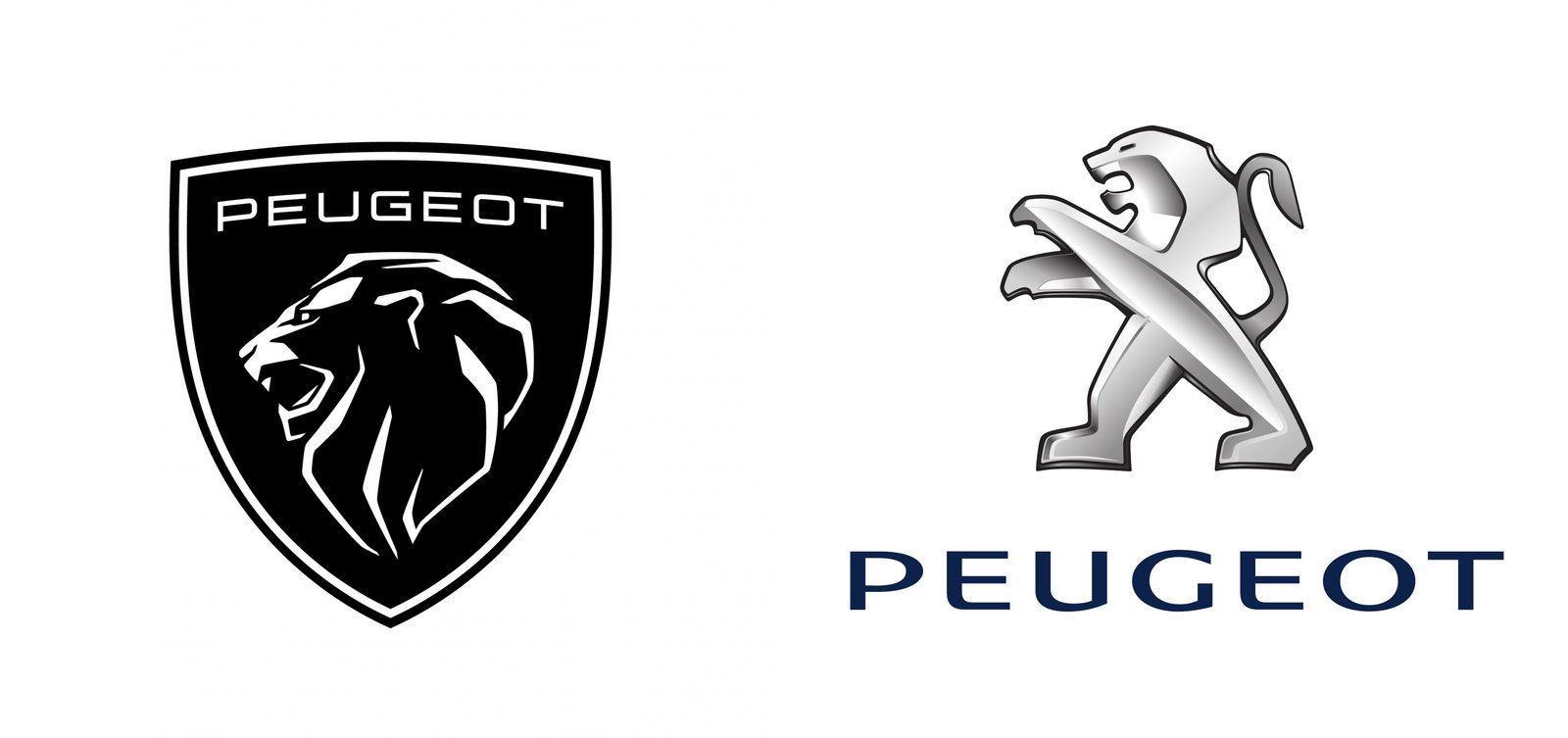
The latest player (at the time of writing) is Peugeot. It’s the 11th update to the company’s Lion emblem used in one form around another since 1850, although it’s not entirely new. One of the most dramatic changes here, it’s effectively a reboot of a similar shield-backed design used in the 1960s.
BMW
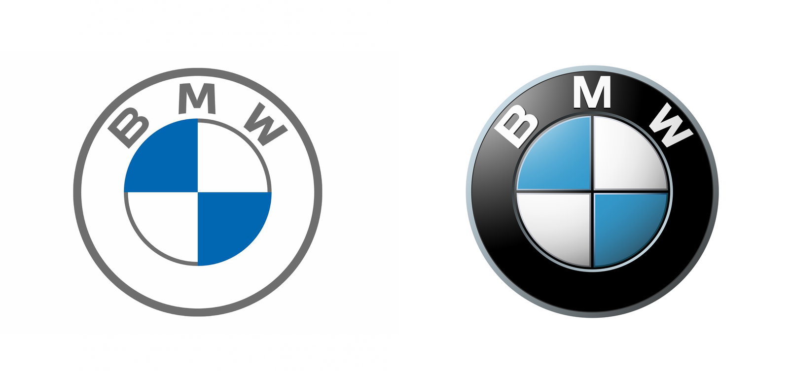
BMW‘s logo has stayed pretty much the same since 1917. It’s only been lightly tweaked over the last century, with the last nip and tuck coming in 1997, some 34 years since the previous change. It’s always featured white and blue quadrants in the middle that represent the Bavarian Free State colours, not a spinning propellor as is often erroneously claimed.
The latest update is arguably the most significant in the brand’s history. In March 2020, BMW revealed a new semi-transparent logo for “online and offline communication purposes”.
Kia
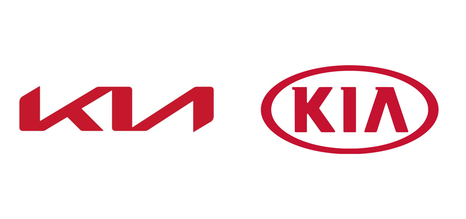
No longer kicking out cheap and cheerful econoboxes, Kia has rebranded to coincide with its push upmarket. The logo it had been using was merely a simplified version of the one carried since 1994, but the new one? It bears little resemblance to the outgoing one. As has been pointed out many times, though, at first glance the I and the A look like they form a backwards N…
Nissan
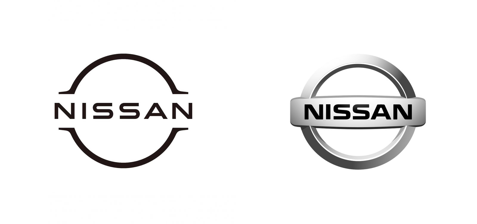
Nissan was rocking the same logo that had been around since 2001 before it was tidied up and ‘flattened’ for this new version in July 2020. “The new logo looks to the future while staying proudly connected to the company’s rich heritage and tradition of innovation,” the company said at the time. It’ll be used first on the Ariya SUV.
Toyota
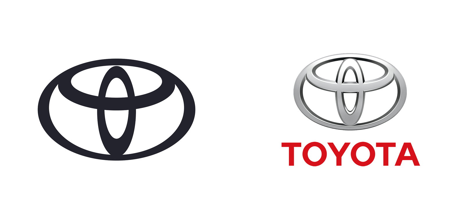
The same month, Toyota went a similar route, ditching the 3D look and dropping the lettering below the logo. The shame remains the same as the badge the company introduced in 1989 to celebrate its 50th anniversary.
In Toyota’s words, here’s what it means:
“The inner ovals symbolise the heart of the customer and the heart of the company, overlapping to represent a mutually beneficial relationship and trust between the two, as well as forming a ‘T’ shape for Toyota. The outer oval one signifies the world embracing Toyota.”
VW
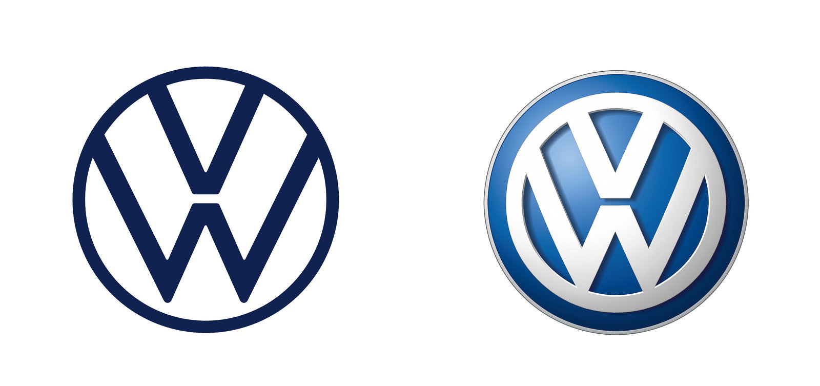
The Volkswagen logo has been conceptually the same since the company’s founding in 1937, with a V sitting on top of a W. The letters were chucked in a circle in 1945, and after that, the logo changed little, adopting a 3D look in 2012. That was binned in September 2019, with the logo brought much closer to the minimalist design VW rolled out in 1967, albeit with a thinner circle and letters.
Audi
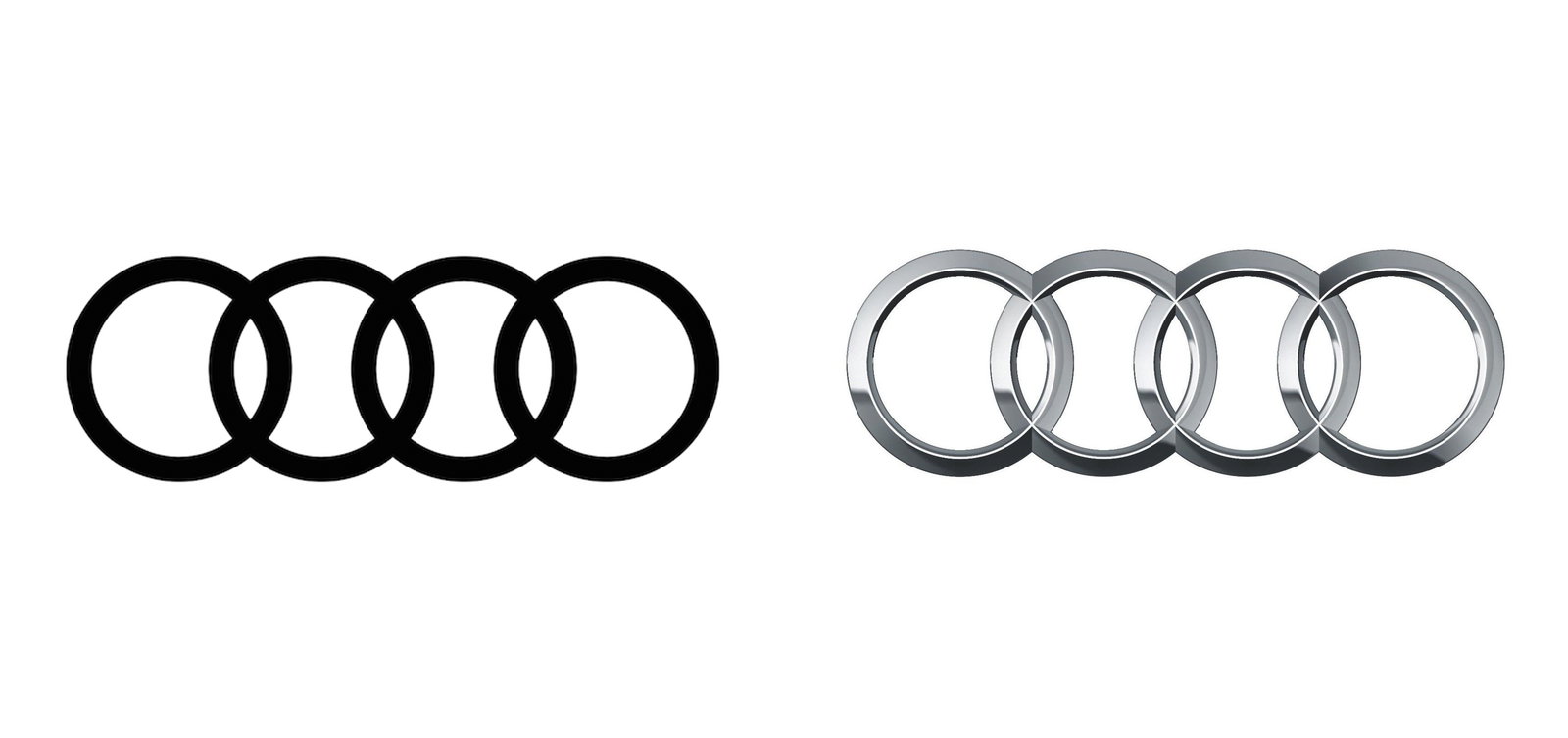
Audi‘s logo tweak isn’t quite as recent as the others here, happening back in March 2018. However, it’s worth mentioning since it’s an early example of the same ‘flattening’ trend followed by its fellow VW Group brand and several other companies noted here.
We still have the four rings, intended to represent the four firms (Audi, Horch, DKW, and Wanderer) that came together in 1932 to make Audi’s forerunner Auto Union. Now, though, the 3D-effect is gone to make what Audi calls a “digital-first” logo.


Comments
Basically every company: going from 3d to 2d
holden updated their logo to this too
Toyota exec: “I want to propose a new logo idea”
“What did you have in mind?”
“What if, and hear me out, it was our logo, but this time, it doesn’t say Toyota”
“Dude you’re a genius!”